Category Archives: Uncategorized

Who has Neville Brody influenced

A great deal of inspiration for the graphics of 3rd Floor has been taken from Neville Brody. Brody is a world famous graphic designer, typographer, philosopher and inventor. Neville Brody challenges the conventions of graphic design and was nearly thrown out of the London College of Printing for designing a postage stamp with Queen Elizabeth’s head turned sideways.

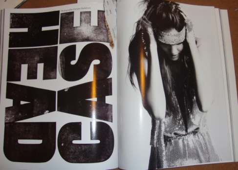
Brody plays with the margins of visual language and has launched his own revolution in typeface design. The V&A have hosted exhibitions of Brody’s work and he has gone on to produce his own book “The Graphic Language of Neville Brody.” He challenges graphic design by playing with scale of type, layering text and placing it at different angles.

Brody was influenced by early 20th century avant-garde design, American album covers and the work of Russian constructivists El Lissitzky and Alexander Rodchenko. In 1981 Brody began exploring new directions for graphic design as art director for “The Face.”

ImageImage

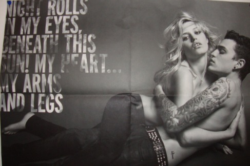
Brody has influenced many other creative professionals and you can see the style of his work coming through in their designs. Plastik, i-D and The hudson jeans campaigns have all followed his graphic style in previous work.
 

Key influences of Neville Brody

As well as being influenced by Punk rock, Brody was also believed to be influenced by Dadaism, which is very similar to a lot of the work he has produced today. Brody like the style and technique used in Dadaism which is possibly one of the reasons why he designs a lot of his work the way he does today. Just like Neville Brody’s work Dadaism is very typographic and very different, they tend to use type heavy designs with abstract images, and a lot like some of the work Neville Brody has designs in his career. I feel that this design technique was very effective and useful in the upcoming of Brody as it is clear that it was an influence to his work, mainly due to the similarities in their work, the only difference is their work each have their own touches of personality to them . As well as being abstract and Typographic his work is very political this may be down to the style of pop art that was also a very popular style of design in the era of Brody’s upbringing. Pop art was one of Brody’s biggest influences due to it being quite political and very abstract. When looking as some of Neville Brody’s work it is clear that pop art was a key influence in his life, as a lot of his work does consist of the bright colours and unusual style that is often seen when looking at pop art. Pop art has definitely helped Brody in experimenting with different colours and making some of his work much more appealing and eye catching to a wider range of audience. I feel that his influences have really helped Brody in becoming what he has today.

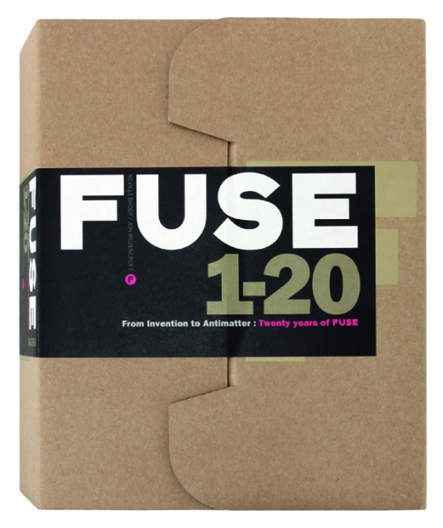
FUSE 1-20 – IDEAS THAT CHANGE DESIGN

Group-Shot-002-copy

A COMPLETE RETROSPECTIVE OF THE INFLUENTIAL, EXPERIMENTAL TYPEFACE PUBLICATION FUSE

Launched by Neville Brody and Jon Wozencroft in 1991, FUSE was the ground-breaking publication that took design and typography into radically new and unforeseen spaces. The major influence of its revolutionary and experimental approach to typographic language reverberates still, and today—twenty years after its launch—the explorations carried out by some of the most famous and influential names in the industry stand out as futuristic and ahead of their time.

Taking the alphabet as its base, and enabled by the advent of digital design, FUSE became a laboratory for new ideas and risks, as well as a hothouse of new thinking. Published over twenty editions, each issue was themed and included both fonts and posters by specially-commissioned collaborators, all of which are on show here.

Image

To commemorate the release of issue 20, TASCHEN brings you a complete compendium of all the issues. Exclusive to this publication are FUSE19 and FUSE20, two newly-commissioned and never-before published issues, in the form of 10 A2 posters and 24 downloadable fonts, making this boxed edition a collector’s item. This is the legacy created by the best contemporary thinkers on typeface design: the list of contributors to FUSE reads like a who’s who of typographic design, from Erik Spiekermann to Stefan Sagmeister, Peter Saville, Jonathan Barnbrook and Tobias Frere-Jones, plus many more. Editorial contributors include Adrian Shaughnessy and Jon Wozencroft.

Included in this special edition:

• 10 exclusive posters from the never-before seen editions of FUSE19 and FUSE20

• A compilation of the work of the most innovative and renowned typographic designers of the last two decades

• Keycard with code to download fonts from issue 19 and 20

• Complete out-of-print issues 1 to 18 compiled in a book designed by Neville Brody

Fonts designed by neville brody

     
Arcadia
FF Autotrace Double
FF Autotrace Five
FF Autotrace Nine
FF Autotrace One
FF Autotrace Outline
FF Blur
FF Dirty Four
FF Dirty One
FF Dirty Seven One
FF Dirty Seven Two
FF Dirty Six Regular
FF Dirty Three
FF Dome Headline
FF Dome Text
FF Gothic
FF Gothic Condensed
FF Harlem
  FF Harlem Slang
Industria Inline
Industria Solid
Insignia
FF Pop
FF Pop LED
FF Tokyo One
FF Tokyo One Solid
FF Tokyo Two
FF Tokyo Two Solid
FF Typeface Four One
FF Typeface Four Two
FF Typeface Seven
FF Typeface Six
FF World One
FF World Three
FF World Two

ABOUT NEVILLE BRODY

Information about the typeface designer Neville Brody and his fonts.

Neville Brody was born in Britain, and studied graphic design at the London College of Printing. After designing record covers for the independent labels Still Records and Fetish Records, he became art director of The Face, a British style magazine.

Between 1983 and 1990 he provided art direction for several other magazines, including City Limits, a London weekly guide, Arena, a style magazine, Per Lui and Lei (Italy), and Actuel (France).

In 1987 he founded his own London-based design practice, The Studio, which worked on several corporate identities and fashion projects for clients including Nike, the Dutch Postal Service, and the German cable channel Premiere.

He has designed several popular typefaces including Arcadia, Industria,InsigniaFF Blur, FF Pop, FF Gothic, and FF Harlem. He is also a partner of FontShop International in Berlin and FontWorks in London, and founding editor of the digital magazine FUSE.

Most popular fonts

The designer’s most popular fonts, as selected by Identifont users over the past seven days:

FF Typeface Seven

FF Blur

Industria Solid

FF Typeface Six

Insignia

Font Font Re-Branding

Font Font is the worlds largest library of original and contemporary typefaces.
Visual identity, logotype, monogram and corporate design realized for the digital type foundry FontFont, founded by Neville Brody and Erik Spiekermann in 1990 in Berlin and one of the largest manufacturers of digital typefaces in the world
Project realized during the final exam of the academic year attended at Accademia delle Arti e Nuove Tecnologie in Rome.
 0eb24bf774d54ca17f07db57736ae2bc
Image4127fbdf10e38349679adbfb21165265
313e95e0f72980e2a8feb56a8ec79bb7
3f2554570e5bade9415d0870e04f894f

Wanted Series

Neville Brody was given the opportunity to design the covers, inserts and label for a DVD series about the digital pioneers – Ed Fella, David Carson, Neville Brody and Tibor Kalman.

(History of Graphic Design/Junior Level)

Solution: Neville Brody called the DVD  series Wanted as all four of these designers were considered renegades as they all broke the rules of traditional graphic design –  each in their own way. I designed each DVD cover to reflect the style of the designer that was featured in the DVD.
ImageImageImage